
Published in Agency life, Creativity, Ideas
Insight by Emily Johnson
In an article from the UK Parliament, it is stated that an estimated 16.8 million people in the UK have a disability or accessibility need, which equates to around 25% of the population. So, designing communications that are inclusive and meet a diverse range of needs is vital, to provide outcomes that are considerate and accessible to as many people as possible.
After working in design and the communications space for ~4 years, I’m keenly aware that creative decisions impact and have weight. Accessibility should be considered throughout the whole process, from brief right through to execution of the outcomes. Content, typography, colour, imagery, layout and other visual elements can unintentionally exclude and alienate certain audiences if inclusivity is not considered. Being mindful in the approach can encourage a shift in mindset for teams and people working in the sector, hopefully leading to a more empathetic approach and an awareness of diverse needs of others. If these things aren’t considered, then it can lead to exclusion, frustration, lawsuits and more.
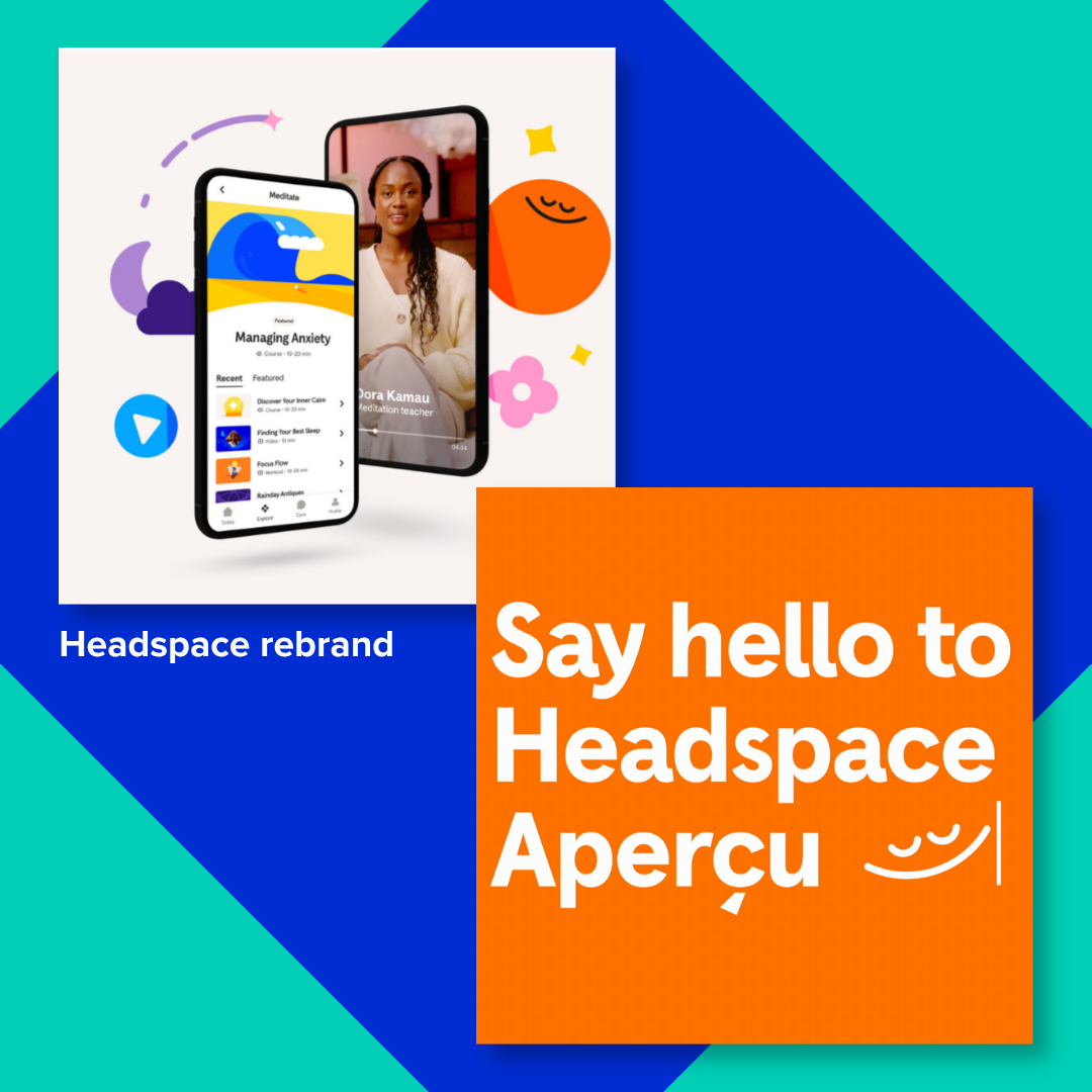
A positive example of a company embracing accessibility, is Headspace. Headspace is a company that provides mental wellbeing tools, such as guided meditations and online therapy services, helping a vast number of people with issues such as sleep, anxiety and stress. It has demonstrated a commitment to accessibility through its website and app design and allows people to personalise their experience, using flexible tools to enable users to adapt the website interface to their preferences and abilities. Including things like, audio description, closed captions and haptic assistance options. Ultimately widening the usability of the site and makes it a clear, intuitive experience.
Recently, Headspace had a brand refresh, introducing a custom typeface, bridging the gap between the playfulness of their business identity with vital functionality and legibility. As well as this, they updated the bold colour palette with high contrast colours, representing a range of human emotions, with the choices feeling considered with optimal contrast and colour combinations.
In contrast to this, a recent brand change that has shaken the design world recently is the Instagram identity refresh. After 10 years, Instagram has taken the leap to update their brand. The most controversial part of this has been the evolution to their identity typeface, which mixes sans-serif and serif letterforms, leading to concerns regarding legibility and a mixed public response. There has been a lot of differing opinions regarding this update, highlighting an important design discussion about the balance between the innovation of an established brand with the accessibility and usability of its visual design.
The pivot in the brand ident is part of a wider roll out of change for Instagram, with a variety of new assets and elements that thread wider visuals together. However, the juxtaposition between the geometric letters and the script in the identity means that some of the letters connect and look like other letters. My gut reaction to the refresh is that effective design is not only about visual impact and evolution but also about ensuring the ident remains readable, inclusive, and accessible to the widest possible audience.
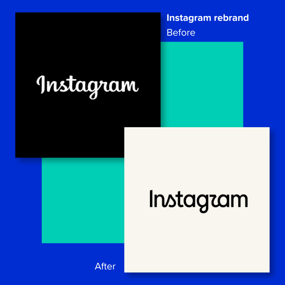
While it will always be a hard task to develop a new look for an iconic platform, I find it surprising that a platform with over 3 billion monthly users has introduced an identity that some people are finding difficult to interpret. When letters are being mistaken for other characters, it raises questions whether visual impact has been prioritised over clarity. For me, the redesign highlights a tension between creating something unique and ensuring that communication remains effortless for the global reach they have with their audience, with a diverse set of needs and abilities.
In conclusion, I think that accessibility should not be treated as a niche concept in a design. It should be a part of how we work, think and create, ensuring that what we make is inclusive, effective in its communication and accessible to as many people as possible.
RECENT NEWS
 Award-winning work!
Award-winning work!
 Design for all: Keeping accessibility in mind.
Design for all: Keeping accessibility in mind.
 3 Trends Shaping the Creative World in 2026